With the amount of times the mobile display as a whole has messed me up, makes me want to give up on logging into the game on phone but 80% of the time i can only be on phone.
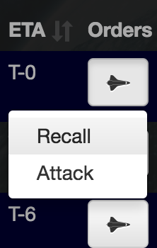
I’ve changed the mobile view to show an action dropdown in place of the raw links. Not quite a confirmation message but serves the same purpose by requiring a second tap to complete a fleet action.
This should prevent sausage finger issues and also save a bit of screen space.
I think the idea that a lot of us have been tossing was left and right. Not sure what you mean by split up and down so I am more partial to the idea that was already in my head
Ok, in that case I do not like the idea - split up and down would make mass sending look like shit.
I am not so sure that you mean table row cells because both ‘buttons’ are in the same table data (td) (if it is even in a table (I am not a big fan of tables due to how they work with accessibility features (I have the basics of accessibility drilled into the way I code)))
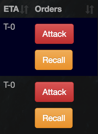
Works same as right now on mobile. You hit the fleet icon and its a drop down menu. Instead of a drop down, you have it split above and below the fleet icon.
The issue isn’t on desktop. It’s a mobile issue. it’s 20 fucking 17. How hard is this? I don’t want to zoom every time I click a fleet to make sure I hit the “attack” button instead of the “recall”. At least 50% of gameplay today is done on mobile. Making it difficult to play on mobile isn’t going to grow the game and is a deterrent.
Surprisingly difficult, actually. There’s too much data going on for the available space. Our choices are either:
remove one of the columns (lose useful info)
make the fonts smaller to free up space (lose readability)
split the buttons into different sides of the screen (lose the cohesion of actions being in a single area)
To be fair, it turns out I misunderstood the issue to begin with. I took it to be an issue with scrolling; I thought when people scrolled with their right hand on the phone that they were accidentally hitting the recall button. Hence, a dropdown was added to prevent accidental scroll taps.
It turns out, the issue isn’t that at all. So we have a solution for a problem that didn’t actually exist. Woops.
I’ll go back to the drawing board to figure out something better. Yes, it’s 20 fucking 17 but shit takes time and mistakes happen. My bad.
Honestly, the issue isn’t a technical one. You can do whatever you want, but the issue is with fat-fingered, impatient players.
I have literally never clicked the wrong one, and I have reasonably fat fingers. Just be a little patient, and be precise.
I personally am having a random action script issue where I can click my picture to go to HQ and it will bring up family 00 page, I can click the bell to view universal news and it cancels all of my portal builds - I guess what I am saying is that I have code fingers
So how do you propose to solve this problem? I’m quite satisfied with the current way it is. I’d hate it to get a confirmation question, because for me that would just be unnecessary extra clicks.
Maybe a bit more distance between the two options could work?
Instead of ‘attack.,recall’ make it ‘attack.,.,.,.,.,.,.,.,.recall’
This was the tradeoff I was worried about. Even with the current dropdown, it slows down attacking.
My current plan is to just rework that section entirely. If tabular data reduces the available space for buttons then the problem might just be with having the data listed how it is.
I appreciate that. To be honest though, I can’t/shouldn’t rely on that. Despite my annoyances with impatient players, they’re ultimately right; if it’s a problem it needs to be fixed.