In prepping an upcoming email template I realized we don’t really have an official logo. It got me feeling curious and nostalgic, so I took a trip down memory lane to look at our old logos, banners, and home pages. Join me!
The Original Version (2000 - 2001)
This is the first one archived on the web, and the first one I remember. It’s a bit quaint, especially with those oddly shaped nav buttons.
Still, 18 years later we’re still using that main image for our logo in several places, including Discord and social media.
Here’s what it looked like the month before it changed in June 2001, sans a working registration button.
The Dramatic Version (2001 - 2002)
This might be the shortest-lived variant, as it was only up for 7 months, just barely making it into 2002.
I call this “The Dramatic Version” because the various overlays and transparencies in the main image. It’s a bit intense.
Below is July 2001, relatively new at the time and with a small styling error:
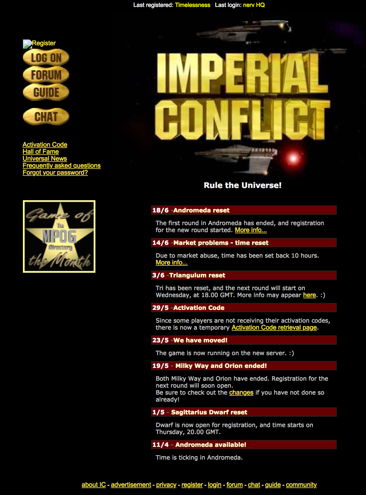
The Blue Version (2002 - 2006)
This is the first version that stuck around for more than a year. It’s also the version we ran at the height of our popularity (2005). Out of all the people who have ever played Imperial Conflict, most saw the game for the first time with this version.
Here it is in July 2006:
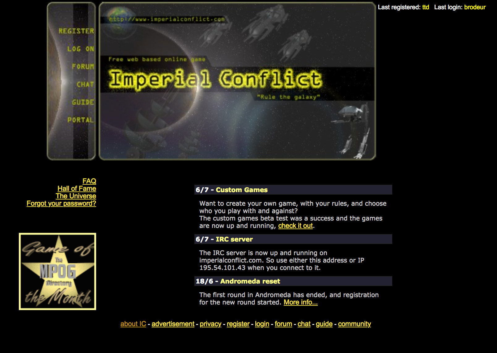
The Boxy Version (2006 - 2013)
To date, this is our longest ever running home page. That’s a bit of a dubious honor, as these years represented a bit of a “dark ages” in IC’s history. It was during this era that admin/dev activity started slowing down significantly, which likely explains why this version stayed for so long.
Here it is in June 2013:
The Big Banner Version (2013 - 2016)
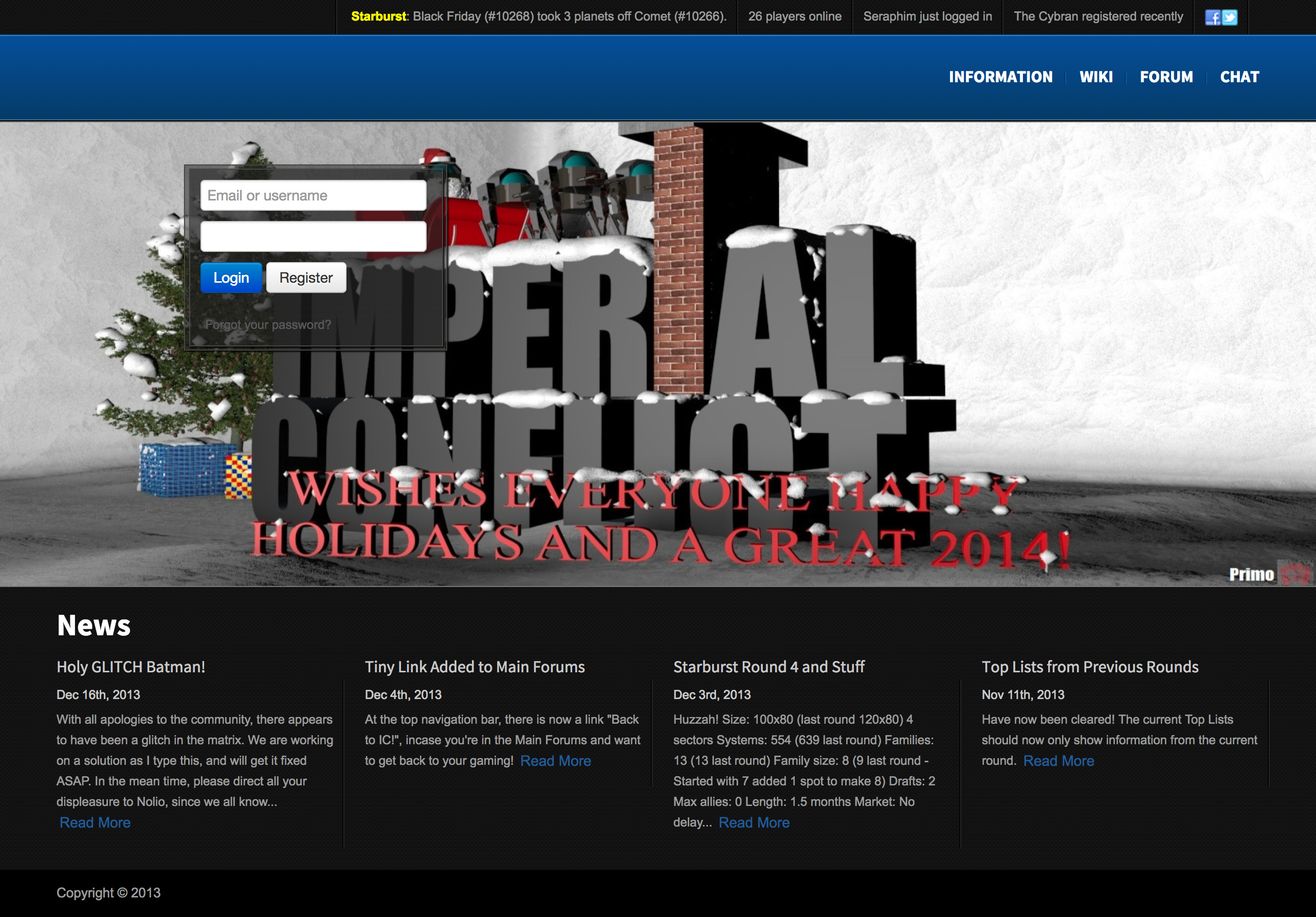
Holiday Variant ('13-'14 Holiday Season)
@Primo blessed us with the holiday themed version of a new home page below. Community contributions FTW!
The page design itself also had some nice improvements, including the top news-ticker that showed multiple items on hover. We also showed off our social links for the first time.
Here it is in January 2014:
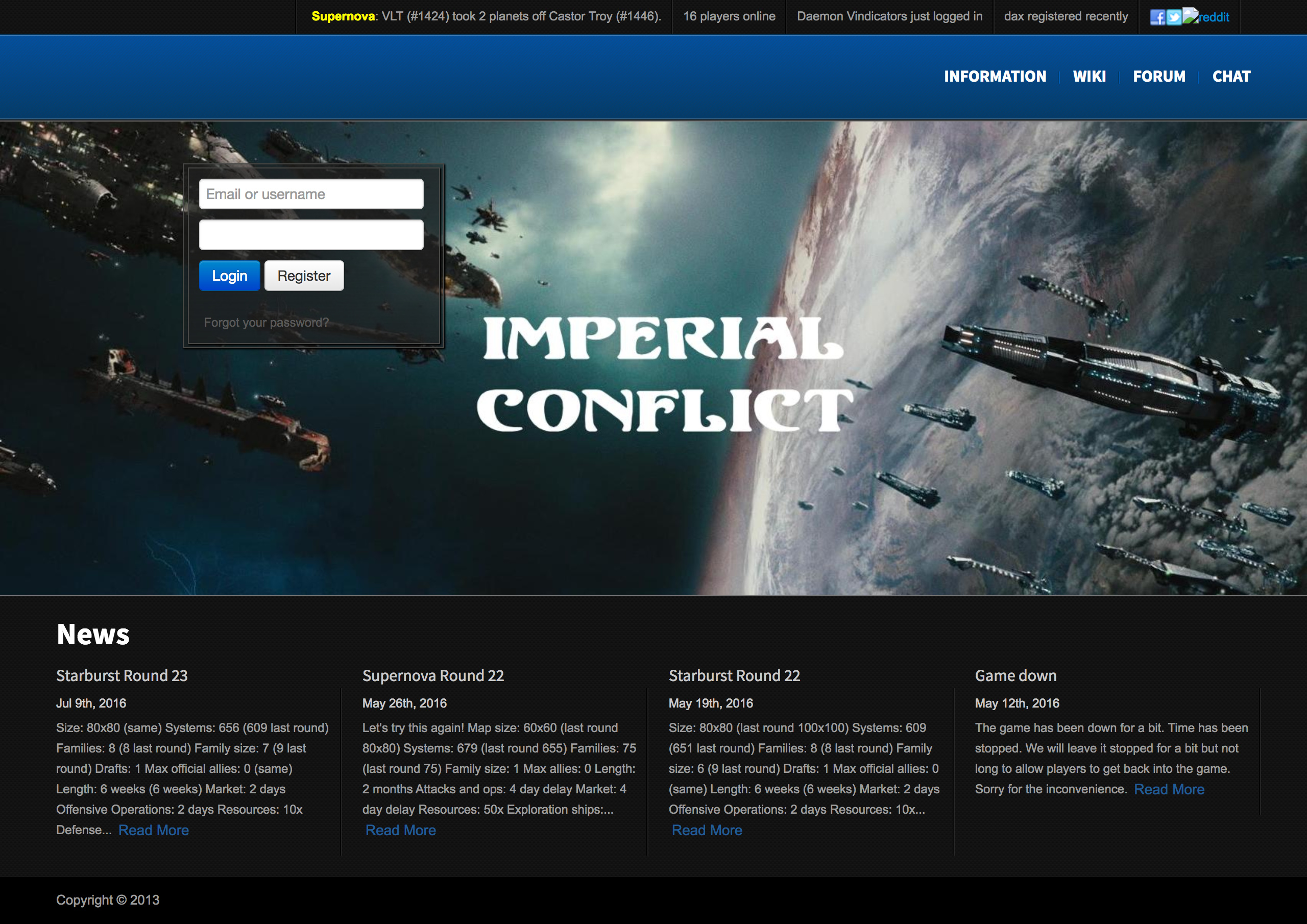
Questionable Variant ('13-'14 Holiday Season - 2016)
The holiday themed version went away and in its place stood the “regular” variant in all its glory. The only problem was: the main image might have felt suspiciously similar to anybody who’s ever watched Firefly. Indeed, this was a blatant rip off!
Here it is in July 2016, shortly before the ownership transition:
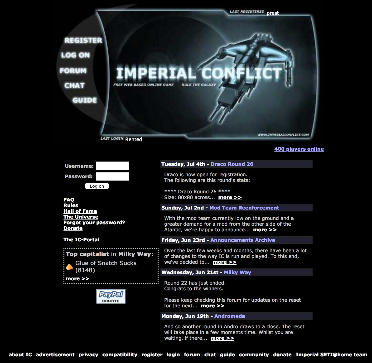
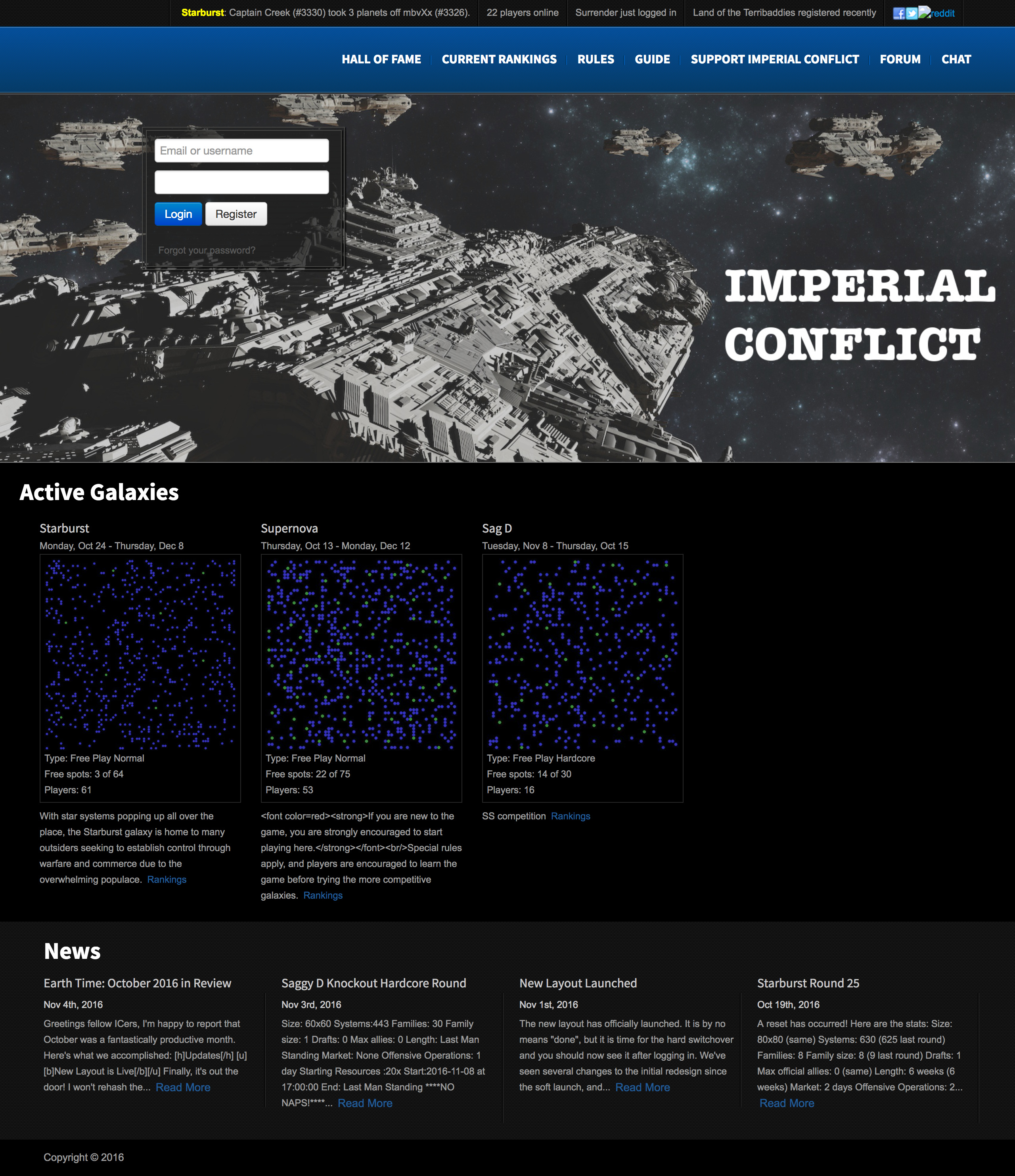
Post-Transition Variant (2016 - 2017)
This is the first version I was ever responsible for. In fact, the very first public-facing code change I made as the new owner was to get rid of that damned image!
commit []
Author: foohonpie []
Date:   Wed Aug 17 12:57:51 2016 -0700

    updating hero to licensed image
This updated image is still what goes out in any ads we pay for.
Other than that, it was mostly the same, aside from a new “Active Galaxies” section. Oh, and our copyright was finally updated in the footer. 
Here it is in November 2016:
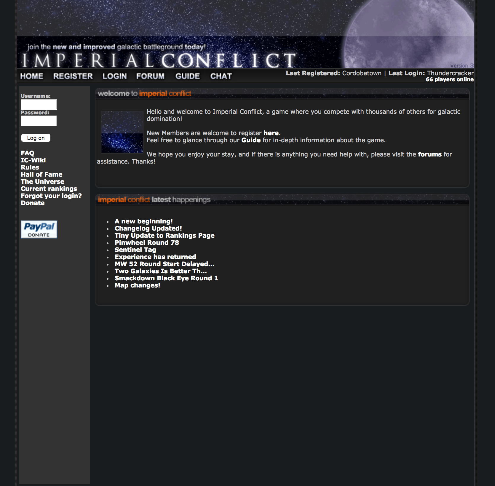
2017 to Present: The Modern Version
This is our current version! I’m fond of this one as it’s the first fully redesigned version I did. There are no relics from any old site code here, and it’s properly optimized for mobile as well.
It also gives credit out to our Patreon Subscribers, which I very much enjoy.
Here it is as revealed in July 2017:

And that’s it!
I hope you enjoyed the nostalgia. 
Which one is your favorite?
- The Original Version
- The Dramatic Version
- The Blue Version
- The Boxy Version
- The Big Banner Version
- The Modern Version
0 voters
 )
)